
If I was trying to explain the concept of a probability distribution to a young child,
this is the kind of animation I would use. I couldn't find a standard one, so
I created my own.

While Darwin's picture of biological evolution was incredibly important
in the history of scientific thought, some systems seem to
elude it's elegant explanations. Here's a picture of the evolution
of disease virulence (defined in terms of transmission rate and
infection duration) for a variation of Bailey's lattice model.
The curves represent the average population phenotype, and the color
changes from black to yellow as time progresses.
Some authors
have observed that evolution seems to minimize infection
duration while maximizing transmission rate. With a slight increase
in mutation rate, though, we also can recover the Darwinian
expectation of maximizing both transmission and duration.
So, intuition still holds, but spatial population
structure can introduce non-obvious complications into disease
evolution.
The code for these simulations is available on GitHub or from me directly.
The code for these simulations is available on GitHub or from me directly.

The sinusoidally forced pendulum can be described by a system of 3 autonomous ordinary differential
equations
\begin{align*}
\frac{d x}{dt} &= 1 \\
\frac{d y}{dt} &= z \\
\frac{d z}{dt} &= \alpha \sin(\omega x) - \gamma \sin y
\end{align*}
This system exhibits chaotic dynamics. In fact, every possible binary sequence is encoded by the winding-number of
the solution of this system for some initial condition on angle and velocity. The diagram shown here is one possible
encoding that helps me visualize this sensitivity to initial condition.
In genetics theories of gene diversity and ecology theories of species diversity
under neutral drift, one of the key results is to characterize the equilibrium distributions of frequencies.
In Hubbell's neutral biodiversity theory, this was characterized by the equilibrium distribution of species under
fixed immigration pressure.
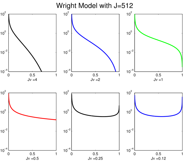
Another way to look at things, is to ask how many times in it's natural lifetime do we expect to observe a random species to have a particular abundance? This depends on the speciation rate \(\nu\) and the population size \(J\). It can be calculated very easily (up to a constant of proportionality) using the formula \[ \sum_{t=0}^{\infty} A^t p(0) = ( I-A)^{-1} p(0) \] where \(A\) is a \(J \times J\) matrix with \[ A_{yx} = \begin{cases} \frac{(1-\nu)x(J-x)}{J(J-1)} & \text{if} & x+1 = y \\ 1 - \frac{(1-\nu)x(J-x)}{J(J-1)} - \frac{x((J-x)+\nu (x-1)}{J(J-1)} & \text{if} & x = y \\ \frac{x((J-x)+\nu (x-1))}{J(J-1)} & \text{if} & x -1 = y \\ 0 & \text{otherwise} \end{cases} \] is the Markov generating matrix for a Wright--Fisher model and p(0) is a vector representing the initial population size distribution (all mass at 1). The figure at right shows that this distribution fundamentally changes behaviors when \( \nu J = 1/2 \)
Another way to look at things, is to ask how many times in it's natural lifetime do we expect to observe a random species to have a particular abundance? This depends on the speciation rate \(\nu\) and the population size \(J\). It can be calculated very easily (up to a constant of proportionality) using the formula \[ \sum_{t=0}^{\infty} A^t p(0) = ( I-A)^{-1} p(0) \] where \(A\) is a \(J \times J\) matrix with \[ A_{yx} = \begin{cases} \frac{(1-\nu)x(J-x)}{J(J-1)} & \text{if} & x+1 = y \\ 1 - \frac{(1-\nu)x(J-x)}{J(J-1)} - \frac{x((J-x)+\nu (x-1)}{J(J-1)} & \text{if} & x = y \\ \frac{x((J-x)+\nu (x-1))}{J(J-1)} & \text{if} & x -1 = y \\ 0 & \text{otherwise} \end{cases} \] is the Markov generating matrix for a Wright--Fisher model and p(0) is a vector representing the initial population size distribution (all mass at 1). The figure at right shows that this distribution fundamentally changes behaviors when \( \nu J = 1/2 \)
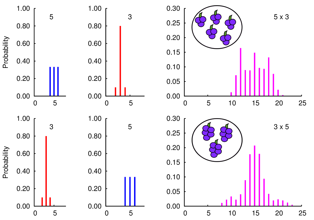
When we define multiplication, we usually ignore any aspects
of uncertainty in the values we are multiplying. While
the order of multiplication does not affect the expected
value of an uncertain product, the order can change
how the uncertainty is distributed around those expectations.
Here is an illustrative example of the probability distributions
for the number of grapes when we have 5 bunches of 3 or 3 bunches of 5.
[Link to related paper] and [Preprint version].
[Link to related paper] and [Preprint version].
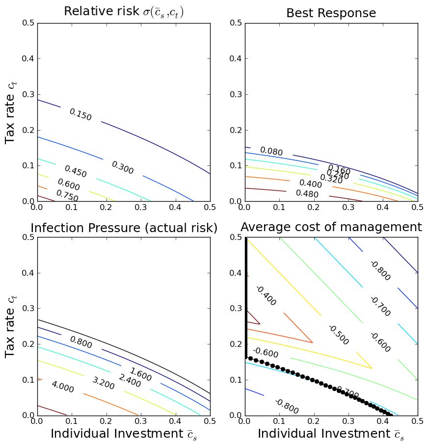
One very useful approach is public health policy design is that
of the ``health commons'', where the economic motivations of
individuals and the management inclinations of government feed
back upon each other. This figure shows various components of a
health-commons based policy analysis. We start out with a
function that describes the effects of individual and government
actions on exposures. Combined with a description of the disease
biology, this determines the infection pressure and the actual
risk of infection. Extending this analysis to include a
game-theoretic analysis of individual responses, we can determine
how the game equilibrium varies depending on the
government taxation policy, and then determine the policy that
has the best management outcomes.
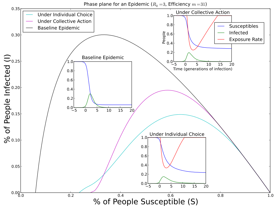
Social distancing is a universal method for coping
with an epidemic. But the amount of social distancing
that should be used depends on perspective. The optimal
amount of social distancing for a community differs from
the game equilibrium pattern of social distancing for
individuals in that community. Optimal social distancing
starts later, leading to a higher epidemic peak, but also
ends later, leading to fewer total infections.
This plot shows the phase-plane orbit for each,
with their time series inset.
[Link to related paper]
[Link to related paper]

In epidemic games with two interacting subpopulations,
the equilibria structures are similar to those of
Lotka competition models and Cournot duopoly models --
there may be no investments, the burden of investment
may be carried by one group, or shared by both groups.
[Link to related paper]
[Link to related paper]
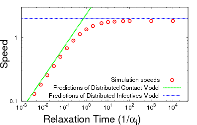
One of the big questions in infectious disease dynamics is
what interactions among individuals are important for disease
transmission, and how do changes in those contacts change
the rate of disease spread. Two classical descriptions of
spatial interactions are the Distributed Contacts and
Distributed Infectives hypotheses. The Distributed
Contacts model says the important thing is our average
contact distribution. The Distributed Infectives model says
the important things are our short-term random contacts.
This figure illustrates a unified theory where either
hypothesis may can predict the speed of spatial spread,
depending on how long it takes to relax to your average
contact distribution.
[Link to related paper]
[Link to related paper]

A model of hepatocyte homeostasis is combined with a
drug-treatment model to match data for treatment of a
patient with hepatitis C virus (HCV).
[Link to related paper]
[Link to related paper]
For some infectious diseases, the morbidity of the disease
changes depending on the age when a person gets sick -- some
diseases are worse when you're old, and some are worse when you're
young. This can make a big difference in how we handle the specific
disease. For diseases that are worse when we are young, the balanced
behavior is to always try to minimize transmission. But for
diseases that are worse when we are old, either minimizing or maximizing
transmission can be good practice for individuals in a
community, depending on how much transmission can be controlled.
This is sometimes referred to as endemic stability in
vetrinary medicine.
The plot shows strategy-invasion diagrams for these scenarios.
[Link to related paper]
[Link to related paper]

Reaction networks based on mass-action kinetics can be represented as
bipartite graph, with one type of node symbolizing each reaction, one
type of node symbolizing the reactants, and directed edges
representing the inputs and outputs of each reaction. These are also
called hypergraphs, petri nets, and matroids. If the edges and nodes
are labelled appropriately, the bipartite graph precisely represents a
system of ordinary differential equations describing the dynamics of
each reactant. This is better than simple graph-representations,
which only represent linear effects correctly.
Many simple mathematical descriptions of disease transmission can be
formulated as reaction networks, so they can also be represented with
bipartite graphs. For instance, this diagram represents
disease-transmission in a species with two distinct stages in its
life-history.
[Link to related paper]
[Link to related paper]

A symmetric bifurcation diagram for a population
model with error-prone culling. I find the comparison
of this to the diagram for the classic
logistic map
interesting.

When points are Poisson-distributed in a plane,
the distance at any location to the nearest point
defines a random surface depending on the point
locations and parameterized by the Poisson intensity.
All the valleys of the surface are the same, but the
peaks have random heights.

The simplest Archimedean spiral is constructed by successive bisection
of radii and angles. The area of the spiral is a third the area
of the inscribing circle. This figure was constructed with
one of the first versions of the Geometer's Sketchpad,
a piece of software released for Macintosh computers circa 1997.
I believe the initial version was supported by an NSF grant.

Aaahhh! A buddy of mine who happens to be a member of a
charismatic species sharing the planet with us.